We talk to five exciting designers about using art as your jumping-off point when creating a design scheme
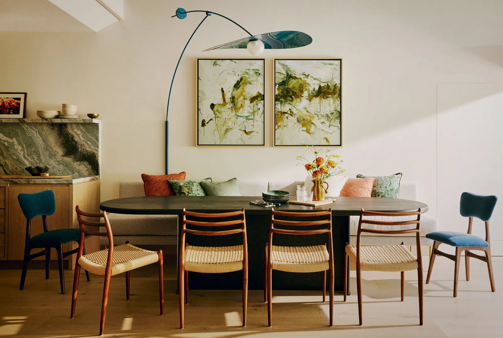
A family home in south London by Studio Ashby, where the texture of the paintings on the wall coordinates beautifully with the marble in the kitchen Kensington Leverne
Staring at a blank canvas can feel impossible. With a million choices – colour, medium, texture, positioning – it’s easy to feel overwhelmed. When you’re redecorating or moving into a new house, that same sweaty-palmed despair can creep in.
You may have an idea of your desired end result, or perhaps you’re really unsure about what aesthetic you’re going for. Do you have some existing furniture, art and accessories you want to fit in? Or are you starting totally afresh? Whatever your jumping off point, there are several methods interior designers rely on to achieve a central focus for a room. Robert Kime famously started his rooms with a rug. Sarah Vanrenen is a dab hand at taking clients’ existing furniture and art and building a scheme around them. Some designers – like Cave Interiors in their recent north London townhouse project – take inspiration from the era of the house, emphasising the period features.
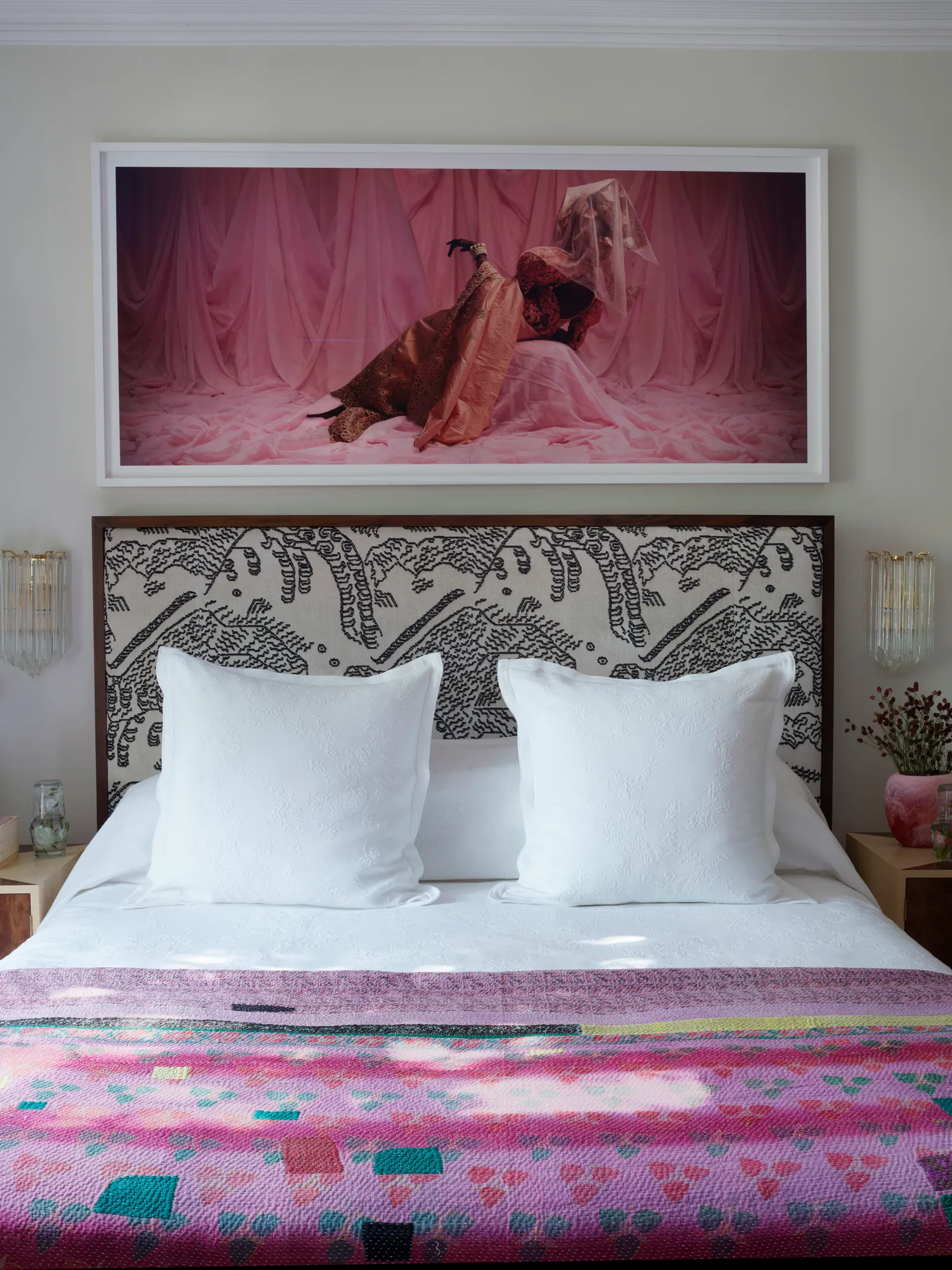
The main bedroom in Sophie Ashby’s family home in London. A Lakin Ogunbanwo photograph hangs above a Studio Ashby bed in the primary bedroom. The headboard is upholstered in Dedar’s Tiger Mountain fabric. Simon Upton
For other designers, starting with the art is the most compelling way to create a cohesive and dynamic scheme. Colours can be drawn out of paintings, anything from contemporary works to traditional portraits, and infuse the whole room.
The texture of sculptural pieces or even the frame of a two-dimensional painting can inspire the use of materials and form in a scheme, too. “Art plays a crucial role in our design process,” explains Romanos Brihi, Co-Founder & Director of Studio Vero. “Whether we’re sourcing a special piece for our clients or incorporating artwork they already own, we often use it as an inspirational starting point.” We talked to five designers about the ‘start with the art’ method, and how they use it best.
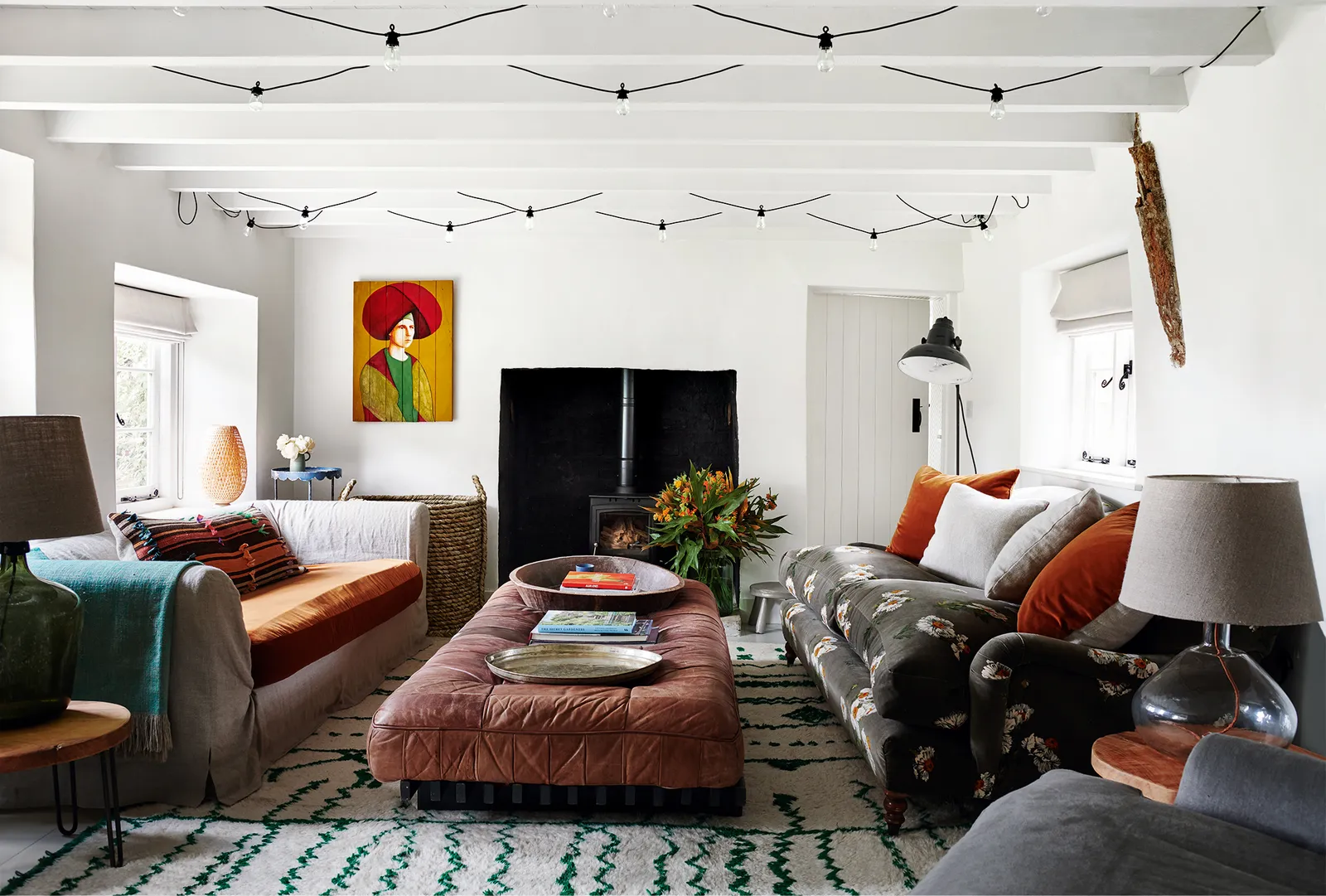
The orange, red and green of the painted portrait to the side of the fireplace informed the colour scheme of the soft furnishings in this cottage in Oxfordshire by Sarah Delaney. Michael Sinclair
Using a client’s existing artwork can make a new house feel instantly familiar and special. Using that artwork to inform the colour scheme or style of a room is a great way to elevate those feelings of familiarity and warmth. “We are always keen to incorporate a client’s own art into a project as it helps to give a personal ‘undecorated’ look to an interior,” says Sarah Delaney of Sarah Delaney Design. “It also links the client emotionally to their own home, which can then spread out into the whole design. If you use their art as a guide for the colour scheme, for example, it will help them to feel familiar with the room,” she explains.
Sophie Ashby from Studio Ashby agrees that using art to inspire a room is just as much about atmosphere as it is about colour scheme: “art inspires soul and that’s why I will forever return to it as a starting point, as it holds so much power. It’s a huge part of our process at Studio Ashby across all our projects but also at our home, Blewcoat, where we host our Artist in Residence series. It’s such a joy to adorn our walls with work from some of my favourite artists today.”
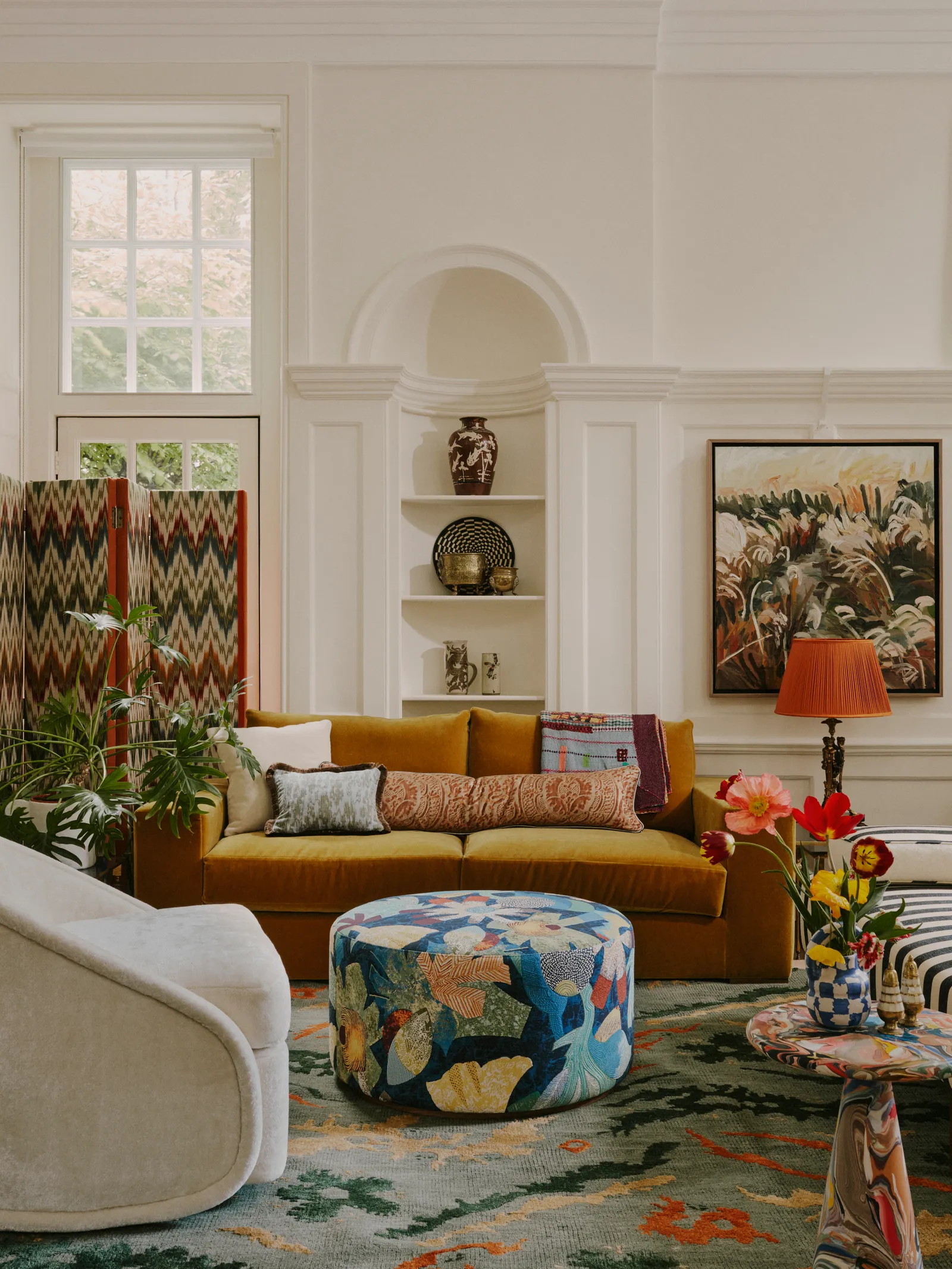
The Sister by Studio Ashby showroom at The Blewcoat School Kensington Leverne
On a more literal level, you can pull colours from all kinds of artworks to use them as the basis for a room. Say you particularly love a piece of abstract art with a wash of blues and reds, you can pick out those exact shades and use them in your house. You can either choose the exact colours, more muted versions or just complementing shades.
Murudé Katipoglu, Founder of Murudé enjoyed building a scheme around a very large abstract painting, an existing piece from his client’s collection: “It was bold, bright, and 3 meters tall. However, we wanted the space to feel calm and light. We pulled some of the colours from this piece of artwork based on the mood we wanted to create. We then sourced paler, muted versions and created a palette for the whole floor. Even the selected marble slabs for the kitchen have the same green and deep pink tones, which we absolutely love and worked hard to find in Italy. We used darker tones for smaller-scale upholstery pieces such as dining chairs, bar stools, and the rug while upholstering the large sofa in pale yellow linen, one of the tones from the artwork, to create a calmer overall feeling.”

A large abstract painting informed the scheme of this project by Murudé
Reluctant to crack out your paintbrushes and introduce bold hues for wall colours? Neutral walls can prove effective foils for bold artwork. But art can still prove a powerful selection tool here, particularly for soft furnishings, woodwork and accessories.
“In the drawing room of our Notting Hill project, a gold leaf tapestry above the fireplace is complemented by bursts of gold in the palm fire screen and the 1970s gold leaf chandelier,” Studio Vero’s Romanos, “An Alejandro Ospina painting provided the palette for the room, inspiring everything from the red cornice, which emphasises the beautiful period details, to the pops of blue in the resin coffee tables.” Adjacent to this space Studio Vero created an informal library and seating area where they “enjoyed translating the mix of textures from the artwork into the patchwork of a George Smith ottoman, upholstered in Pierre Frey fabric.”

‘Bathers at the Marshes’ by Theo Bardsley inspired the scheme in Studio Vero’s Holland Park project S
Shapes and forms can also be drawn from artworks and translated into your interior scheme. “We echoed the artwork’s free-flowing organic shapes in the bespoke ‘Meltingpot’ coffee table, crafted from recycled plastic by Dirk van der Kooij,” explains Romanos of their Notting Hill project.
In the drawing room of their Holland Park project they took a different approach, keeping most of the tones neutral to “fully showcase the artwork’s colours,” as Romanos puts it: “The painting’s blue hues are referenced in a vintage low seat from Ignazio Gardella, Italy (circa 1955).” Ed O’Donnell of Angel O’Donnell used the shapes in a painting by British oil painter Tate Gall to inspire the the rhomboidal shapes in their upholstered bedroom wall design in this bedroom. “His vibrant geometric shards – reminiscent of shattered stained-glass windows – provided us with a bold and enlivening palette for the rest of the apartment,” explains Ed, “Everything from jewel-toned wallpaper to berry-hued sofas was borne from this one, slightly obscure, abstract.”
There are several ways to use artwork as the starting blocks for a design scheme. So, the next time you’re staring into the void of an empty room, turn to your favourite pieces of art as inspiration for anything from colour scheme to furniture form. The artwork doesn’t need to be large or expensive, you just need to be fond of it. Even the smallest framed postcard might prove to be your most motivating decoration catalyst.



+ There are no comments
Add yours