With the help of architectural studio Bindloss Dawes, the colour curator at Farrow & Ball replaced an ‘unliveable’ structure with a build that is contemporary yet sympathetic to the rural landscape, and which has just won a prestigious RIBA award for architecture in England’s south-west
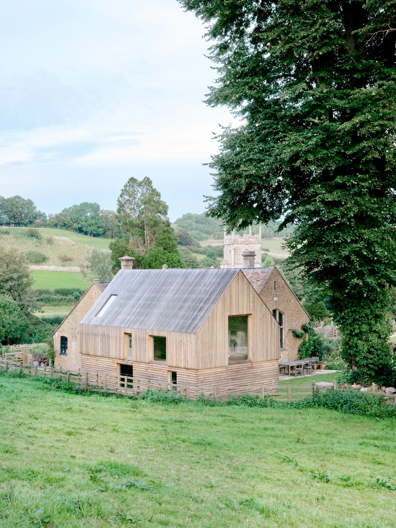
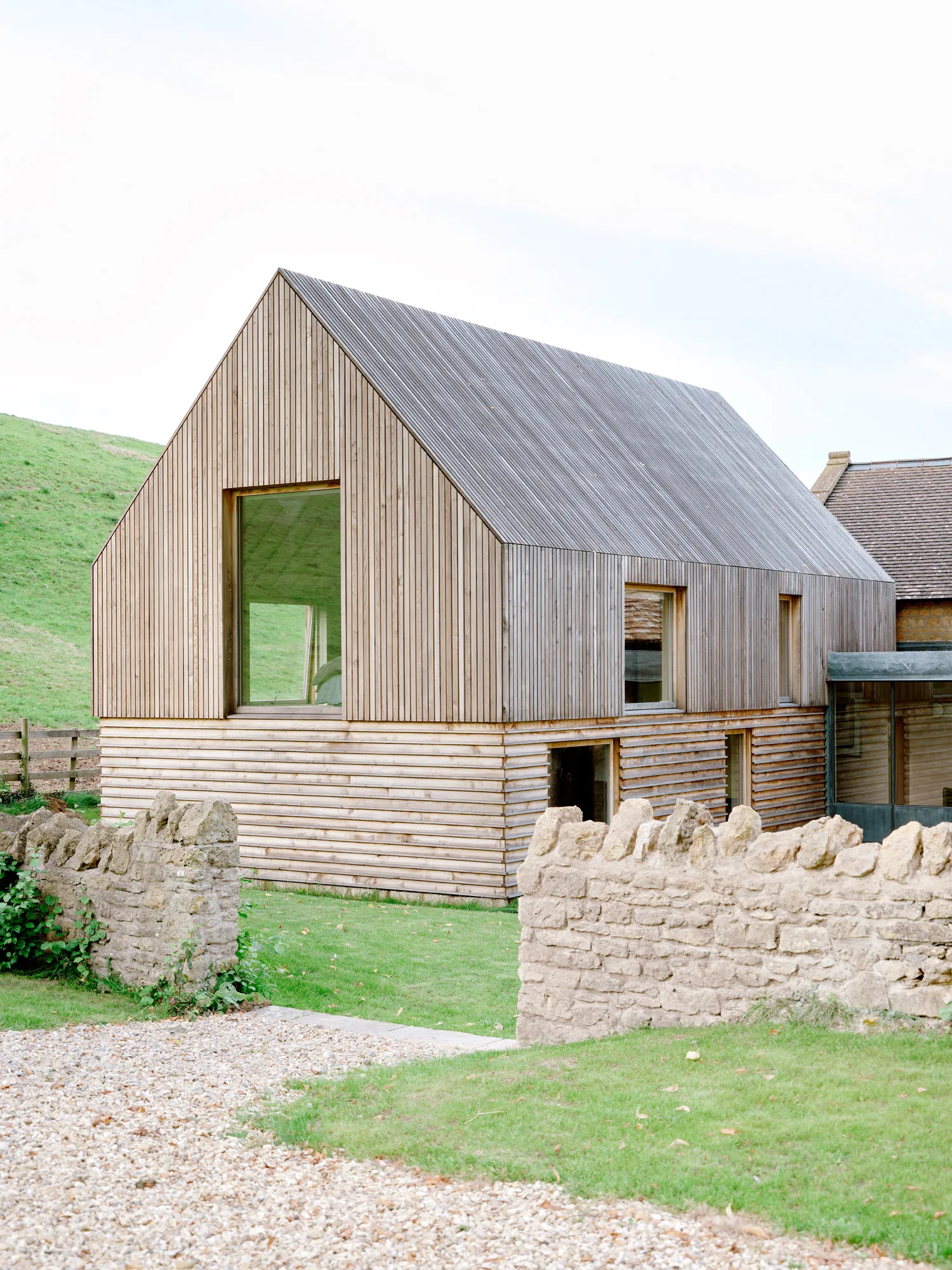
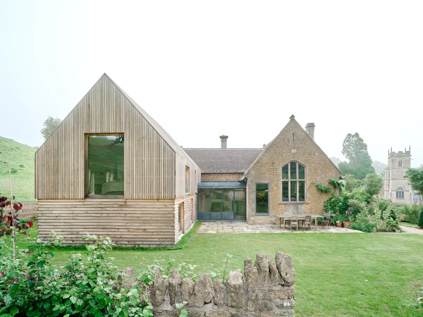
Joa’s house in Somerset, with the new addition visible in the foreground Francesca Iovéne
The decision to add an extension to a period building usually poses a number of design conundrums. One crucial one is a matter of aesthetics: do you try to ensure that the old and new structures appear so seamlessly blended that the untrained eye would be hard pushed to see the difference? Or do you go for broke and embrace a modern contrast and with it, all its architectural possibilities? The chances are most people, keen on clear cohesion, would opt for the former. But as anyone who is familiar with Joa Studholme and her work as colour curator for Farrow & Ball knows, she does not shy away from making a bold statement. So true to form, she chose the latter.
The period building in question is her 19th-century converted schoolhouse in rural Somerset which was featured by House & Garden in March 2023. Joa and husband Andrew fell for the home on sight back in 2018, largely because of its expanse of natural light, lofty ceiling heights and picturesque setting.
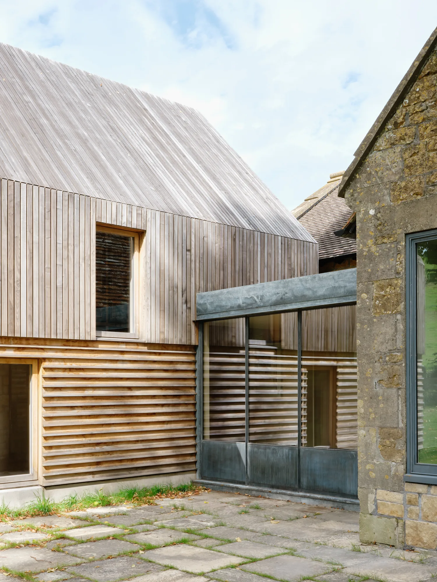
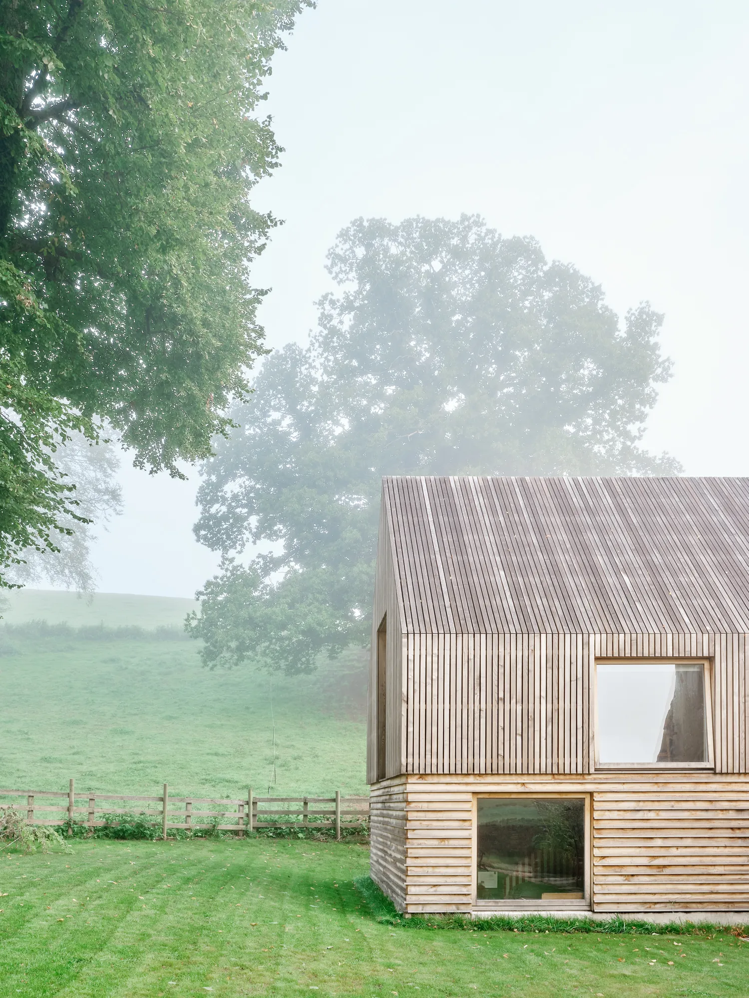
The new extension takes a direct reference from the original schoolhouse, so that it matches its height and shape but uses timber for a more contemporary spin. Francesca Iovéne
However, on living there it gradually became clear that the layout did not flow as well as it could, and once Joa started to unpick the problem, all roads led to the original extension which was built in the 70s and was where all three bedrooms and two bathrooms were located.
“It was so badly designed that you had three of the tiniest bedrooms and a ridiculous amount of corridor,” recalls Joa. “But the main thing was that it was really badly built. It was so damp, in the winter it was almost unliveable.” There was a catalogue of other problems. The main bedroom was only accessed through a flight of “quite dangerous” steep stairs and further explorations revealed the extension was riddled with asbestos.
Joa was introduced to architect George Dawes, co-founder of the architectural studio Bindloss Dawes, who had recently relocated to Somerset from London and specialises in considered conversions and sensitive refurbishments.“We looked at a lot of options to rectify the extension,” says George. “But in the end, demolition was the most appropriate.”
A drastic move perhaps but one that immediately untapped a lot of design potential. The previous structure had been built to mimic the original building with a stone facade but straddled a no-man’s land where it looked neither authentic nor novel. However George decided on a different approach by giving a respectful nod to the original architecture while embarking on a thoroughly modern build.
“The idea with the new extension is that it’s partly sunk and that the roof and the mass of the building takes a direct reference from the schoolhouse, so that it matches in terms of its form, but is articulated in a more contemporary way,” he explains. Joa was immediately onboard. “Andrew and I were just incredibly excited by George’s designs. Also we had absolutely no problem with planning.”
The reason behind this is worth noting. “The guidelines for dealing with historic buildings is that when you add something new, it should be discernible,” says George. “Historic England actually encourages this. If you put something that tries to copy the original, it starts to blur the line and you can’t see and appreciate the original architecture.”
The replacement two-storey addition has increased the floor area while sitting on the same footprint and is clad in locally-sourced sweet chestnut. “We talked about many timbers,” says Joa, “but this is an English timber and it weathers well.” It will eventually age into a silvery shade, a deliberate choice by George. “The local Hadspen stone has softened into a beige, silvery colour so the idea is that the timber would be sympathetic to the original stone.”
Joa adds: “Even though they’re completely different materials, they sit well next to each other.” Different cladding combinations were toyed with and horizontal boards were decided on for the lower ground – comprising two bedrooms and two bathrooms – while above, which has the main bedroom, dressing room and bathroom, features vertical stacks.
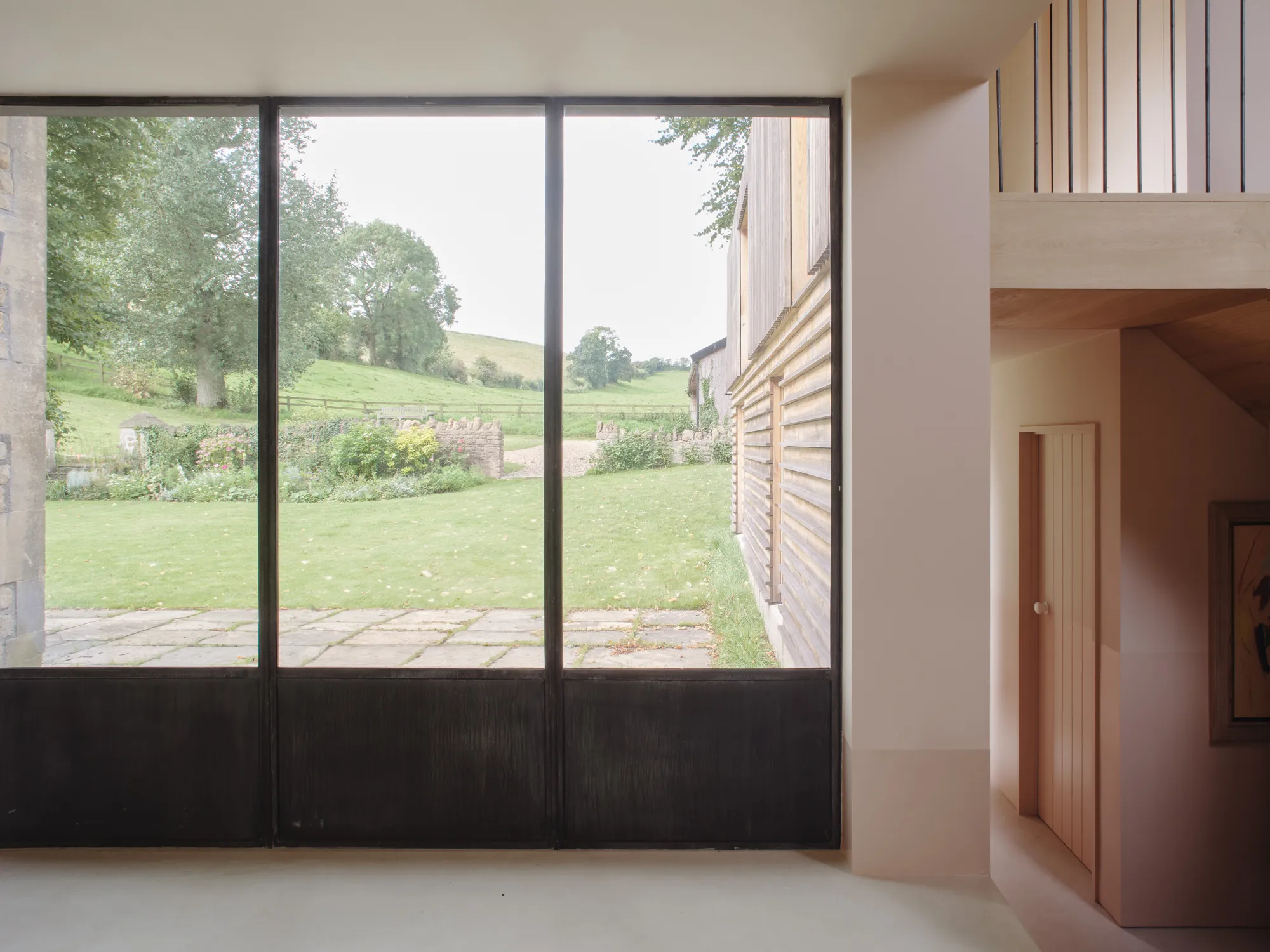
The plot offers 360 degree views around the countryside and this helped determine the layout of the rooms. “We were very conscious of making each have a different view so it is a slightly different experience,” explains Joa. A smaller link building with patinated galvanised steel doors connects the old and new structures and provides a casual seating area. “It didn’t seem right to pick either timber or stone – it felt like it needed to have its own language so it has a flat roof and lots of glass,” says George. The offensive steep staircase has been replaced with a suitably sized chestnut and concrete one.
As Joa’s job is developing Farrow & Ball’s paint shades, it was inevitable colour would play a central role in the finished result. Rather uncharacteristically, Joa had chosen a soft white in the living spaces – which inspired her to create the colour School House White – but for the new extension, she felt the pull of more saturated hues.
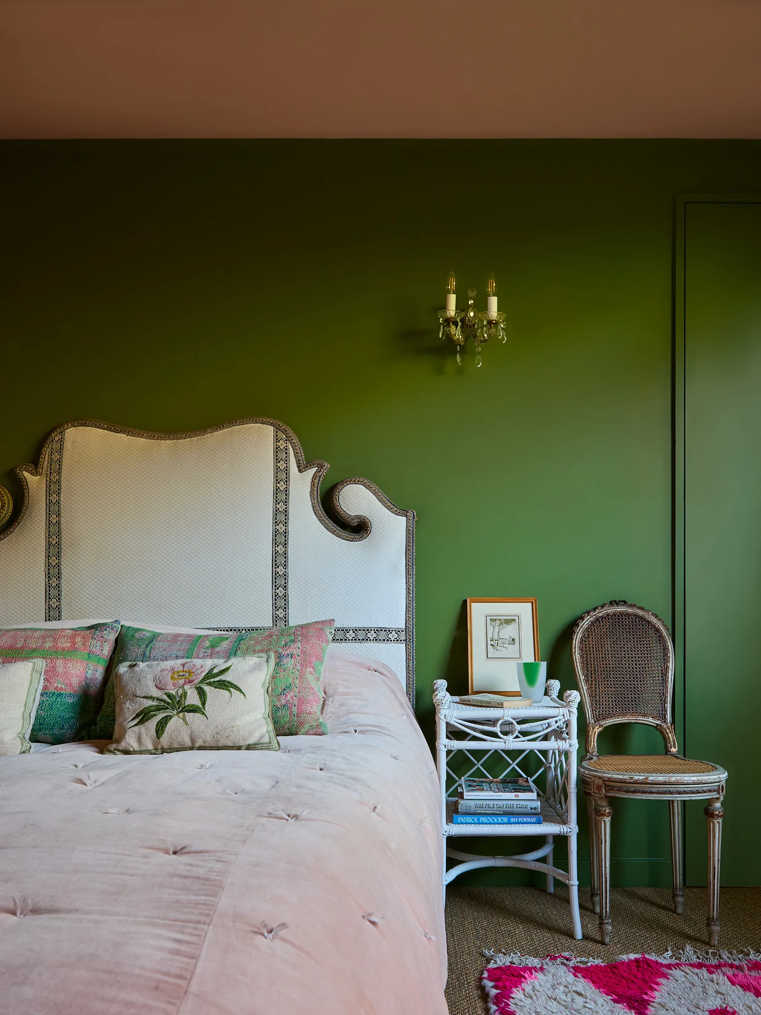
The hallway is bathed in Farrow & Ball’s Setting Plaster which softens the concrete floor while the bedrooms enjoy a palette of soft blue, rich reds and vivid verdant. Every element of the guest bedroom, overlooking a hill, is painted Sap Green to echo the view outside. “These rooms are not assigned because the children don’t live at home anymore. So I really wanted people to have a treat and enjoy something different.” says Joa.
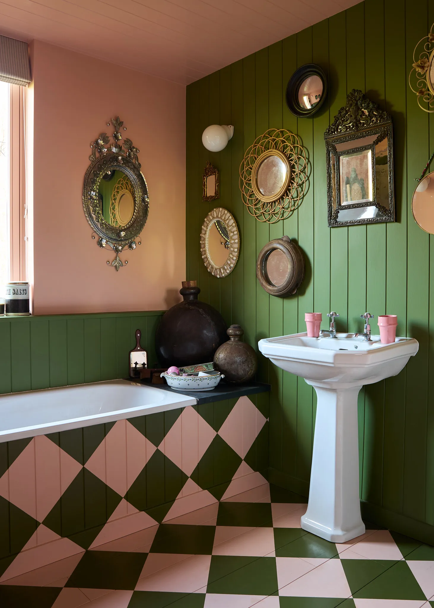
The adjoining bathroom is a combination of the green and Pink Cup, an archive colour, which is used to create a chequerboard design from the bath panel to the wooden floor. In her bedroom, the window has been painted a muted green to draw the outside in.
“The extension has transformed how we live and I absolutely love it,” says Joa. “George was unbelievably patient. We wanted the same thing so it was a really enjoyable process.”
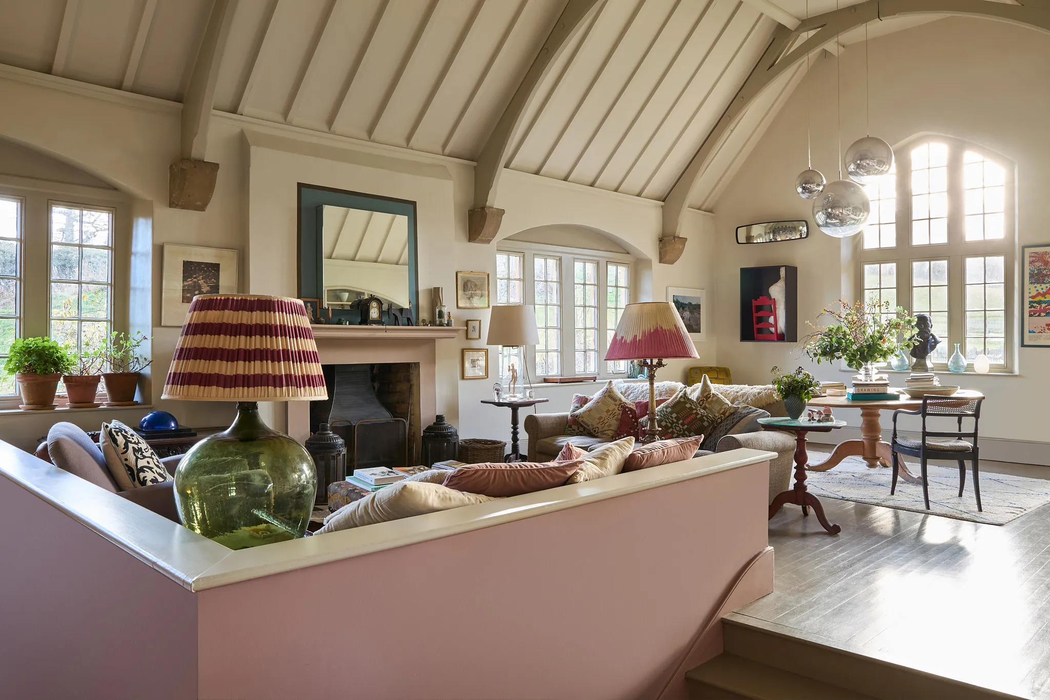
Back in the main house, Joa’s living room was once the main school room. The floor had been raised by the previous owners in order to enjoy the countryside views.
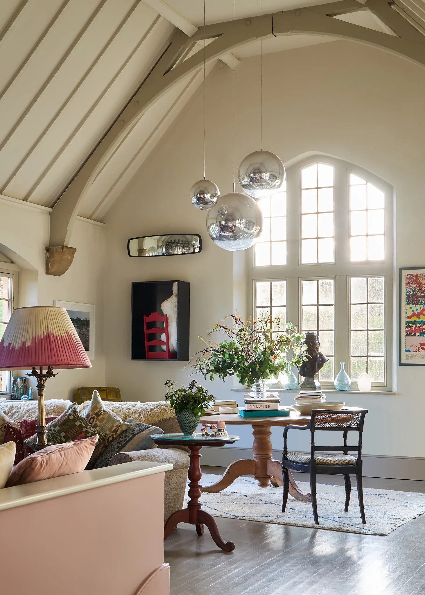
Joa’s living room is painted Farrow & Ball’s School House White, a colour she created that was inspired by the original school house and which also makes the ideal backdrop for her eclectic pieces. The floorboards are painted in the contrasting Mouse’s Back and the low wall is painted in ‘Sulking Room Pink’.
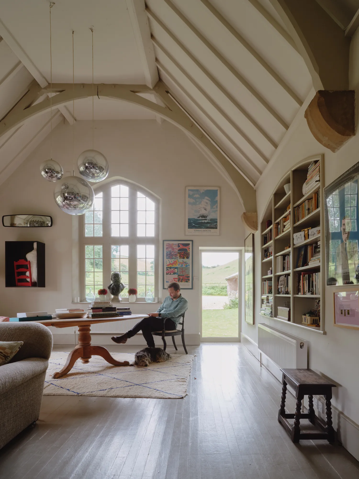
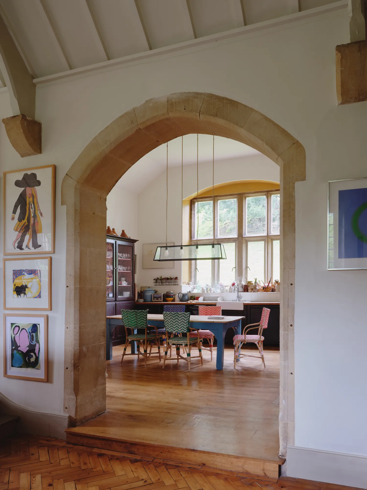
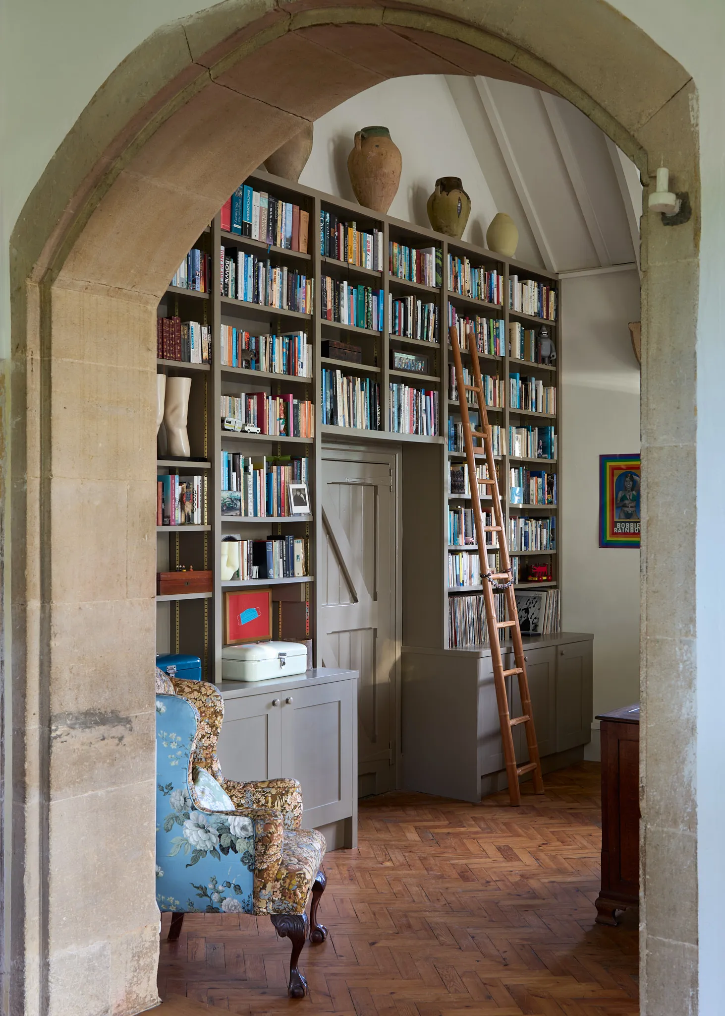
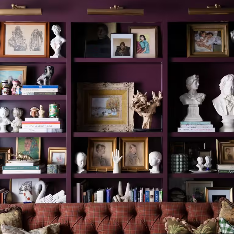
In the library area, the bookshelves have been painted in ‘Mouse’s Back’ to draw the eye to the books and objets.
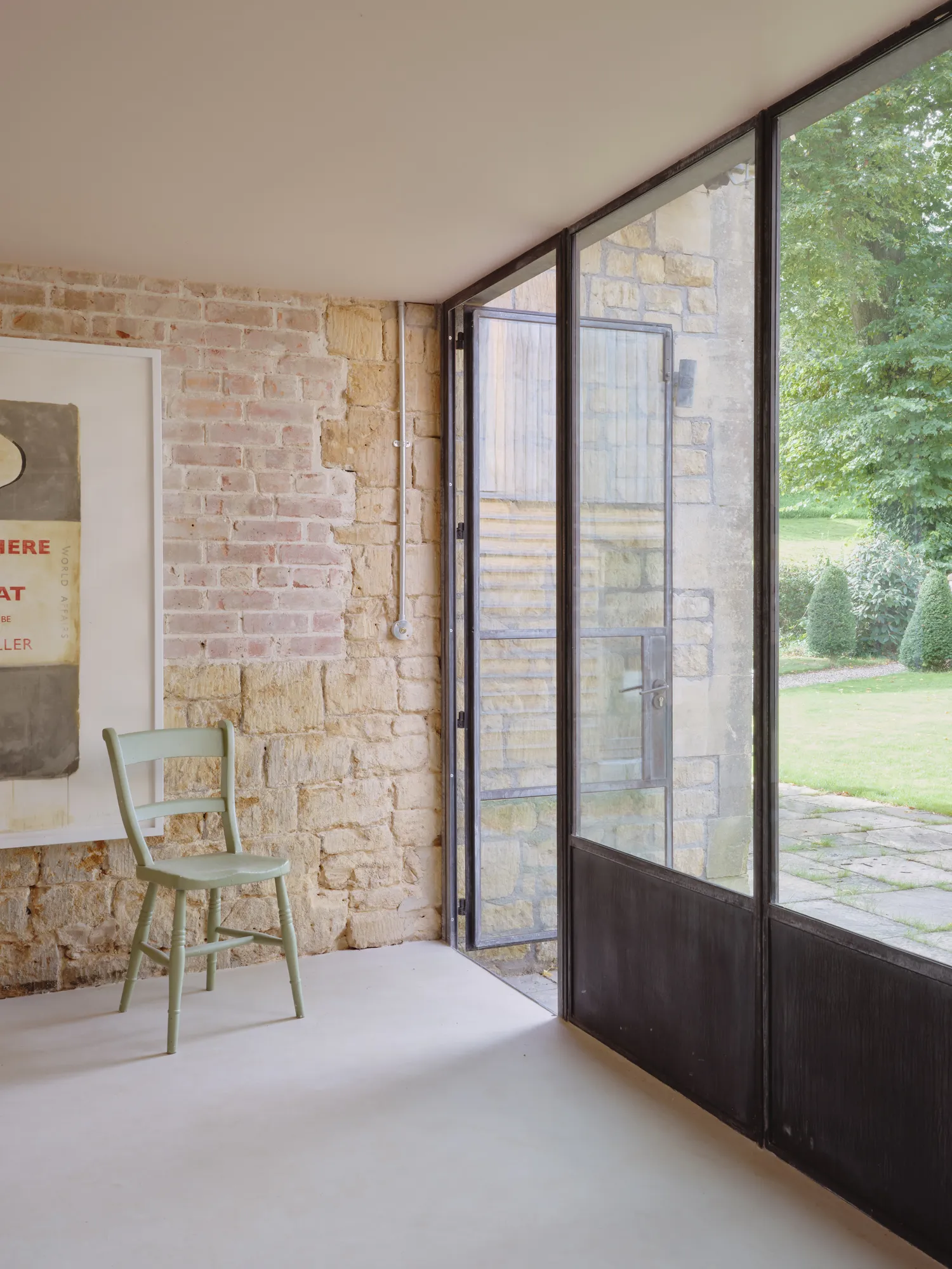
This space links the old and new parts of the house.
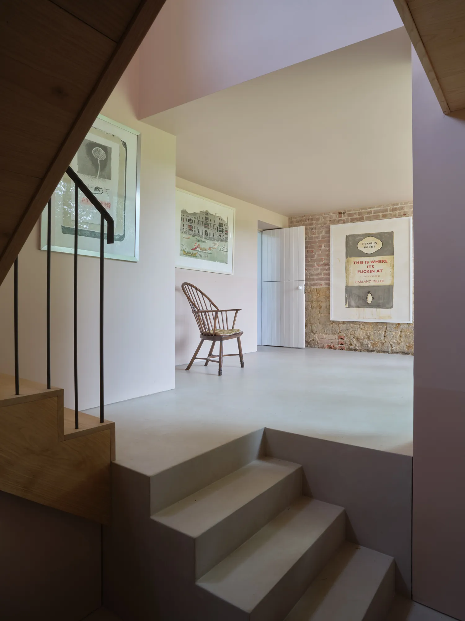
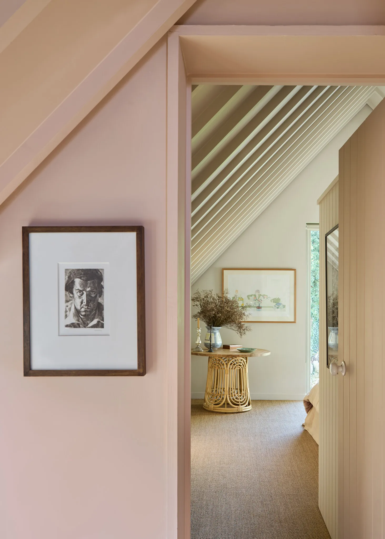
Leading into Joa’s bedroom, the hallway and woodwork are painted ‘Setting Plaster’ by Farrow & Ball. The rattan table is from La Redoute.
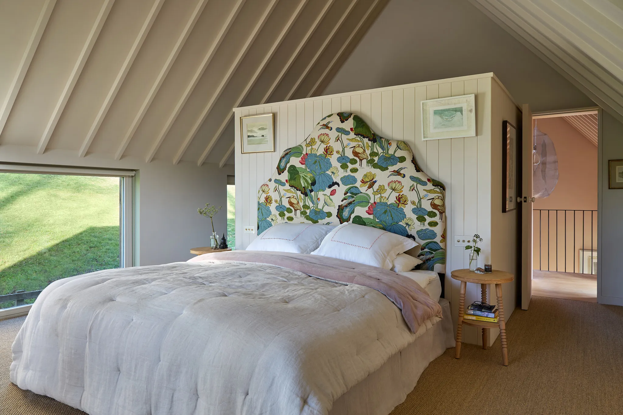
Joa’s bed was brought forward to enjoy the picture-perfect views. The headboard is upholstered in “Nympheus’ by GP & J Baker, made by No Naked Windows. The spindle side table is from NiX by Nicola Harding.
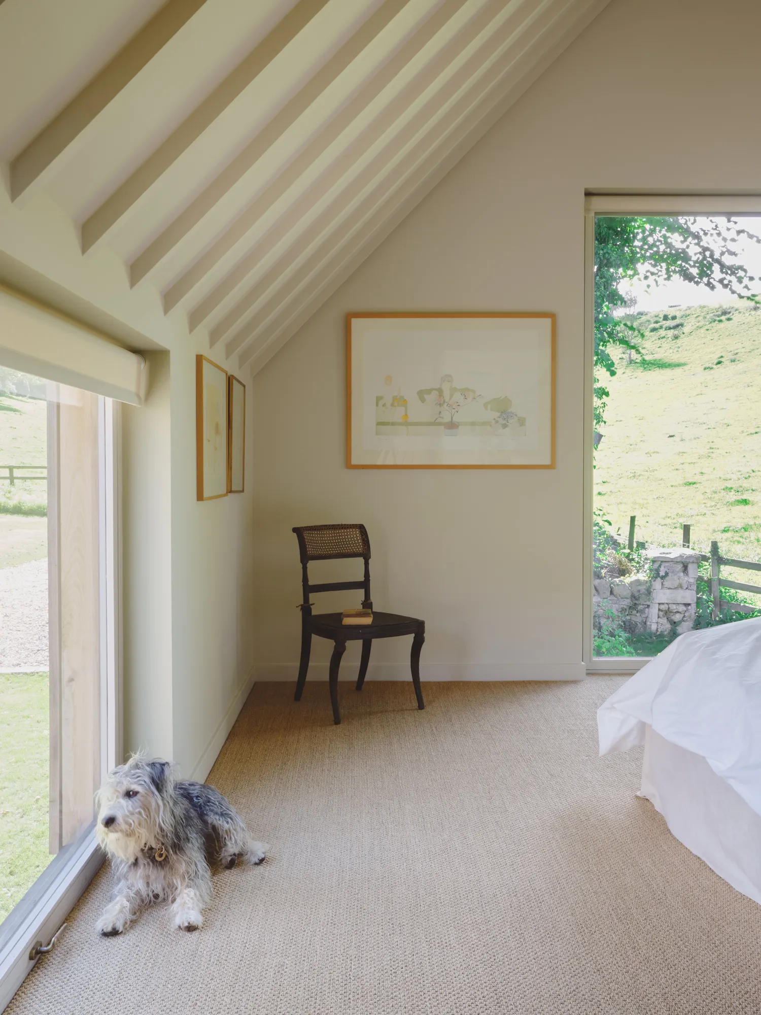
The architect George Dawes was keen to ensure each room took full advantage of the countryside views from as many angles as possible. The walls are painted in Stirabout, a neutral that would not detract from the outside.
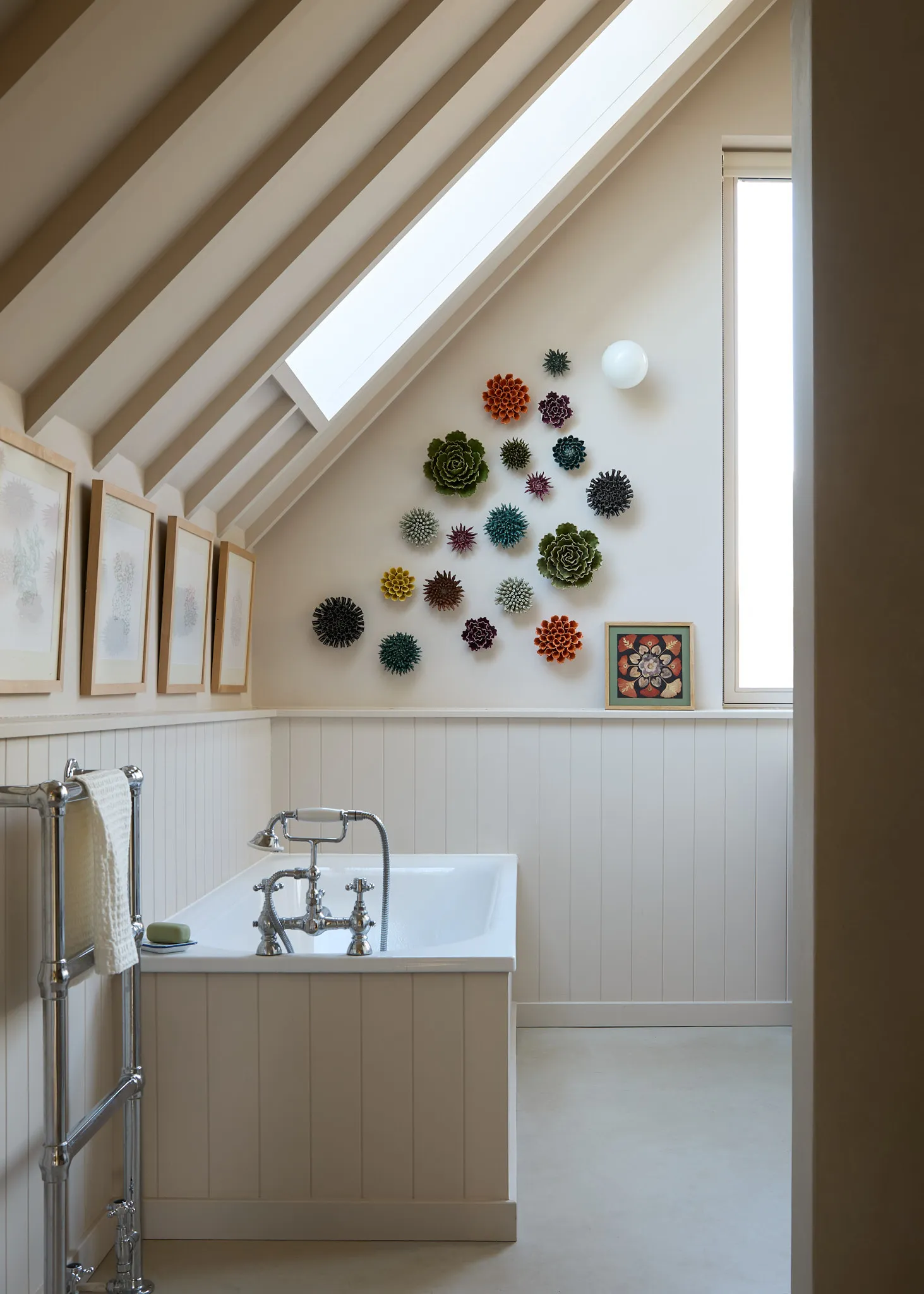
Joa used panelling to add character to the bathroom and echo the lines in the pitched ceiling. The bathroom is painted in Stirabout and the ceramic wall art pieces are from Chive.
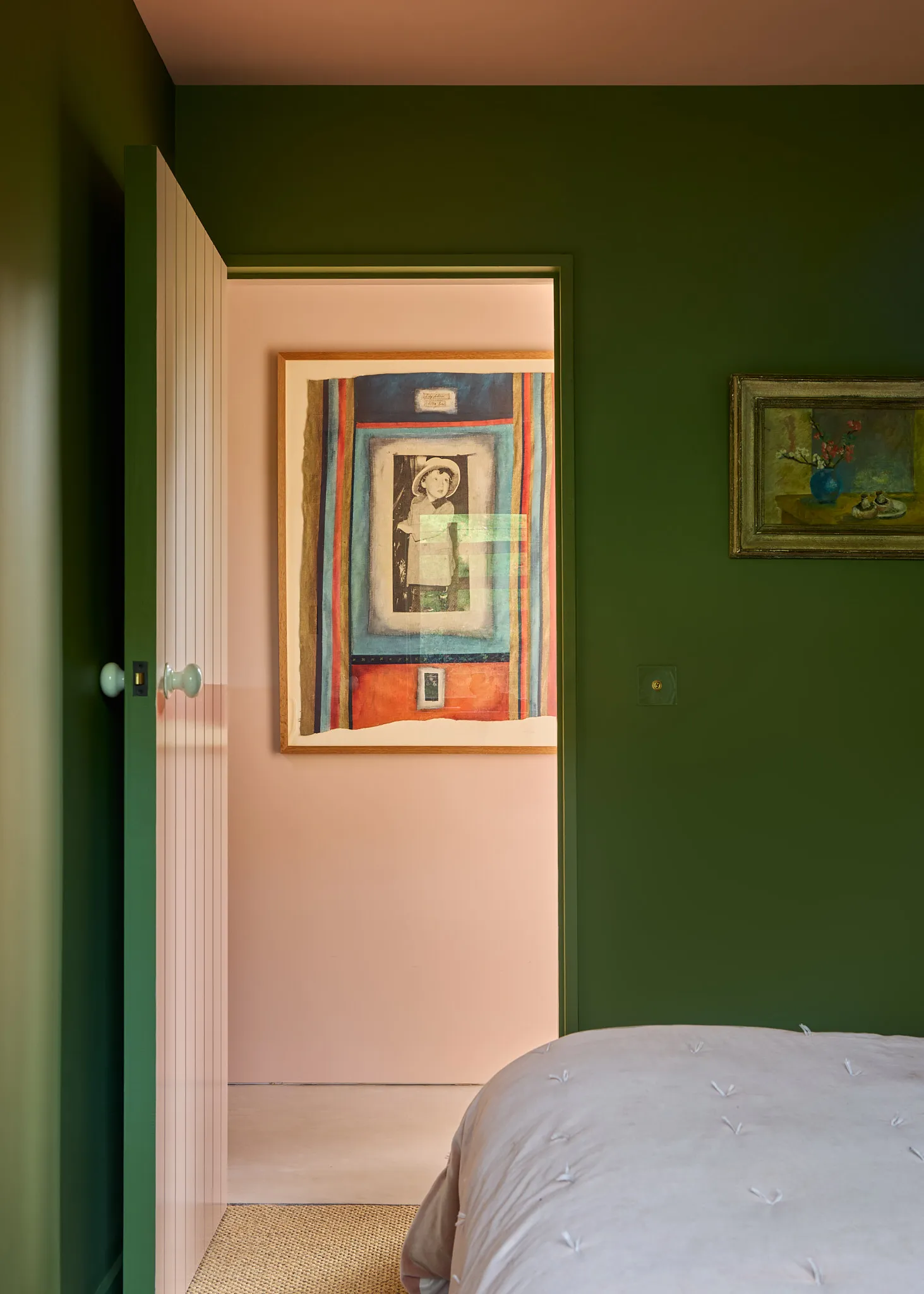
The front of the bedroom door and the hallway are painted Setting Plaster.

The guest bedroom is painted Farrow & Ball’s Sap Green to link with the outside views and the adjoining bathroom walls are painted in Pink Cup from Farrow & Ball’s archive collection.

In the bathroom, Farrow & Ball’s Sap Green and Pink Cup were used to draw a chequerboard design onto the bath panel and the wooden floor. The vintage mirrors in varying styles and shapes, from The World of Differents, add a decorative note.
The lower walls and woodwork of the hallway is painted a gloss finish of Farrow & Ball’s ‘Setting Plaster’ which not only helps to reflect light but makes it more impervious to scratches and marks. Inside the bedroom Joa chose ‘Inchyra Blue’ as the main colour and ‘Light Blue’ as a softer alternative to white.

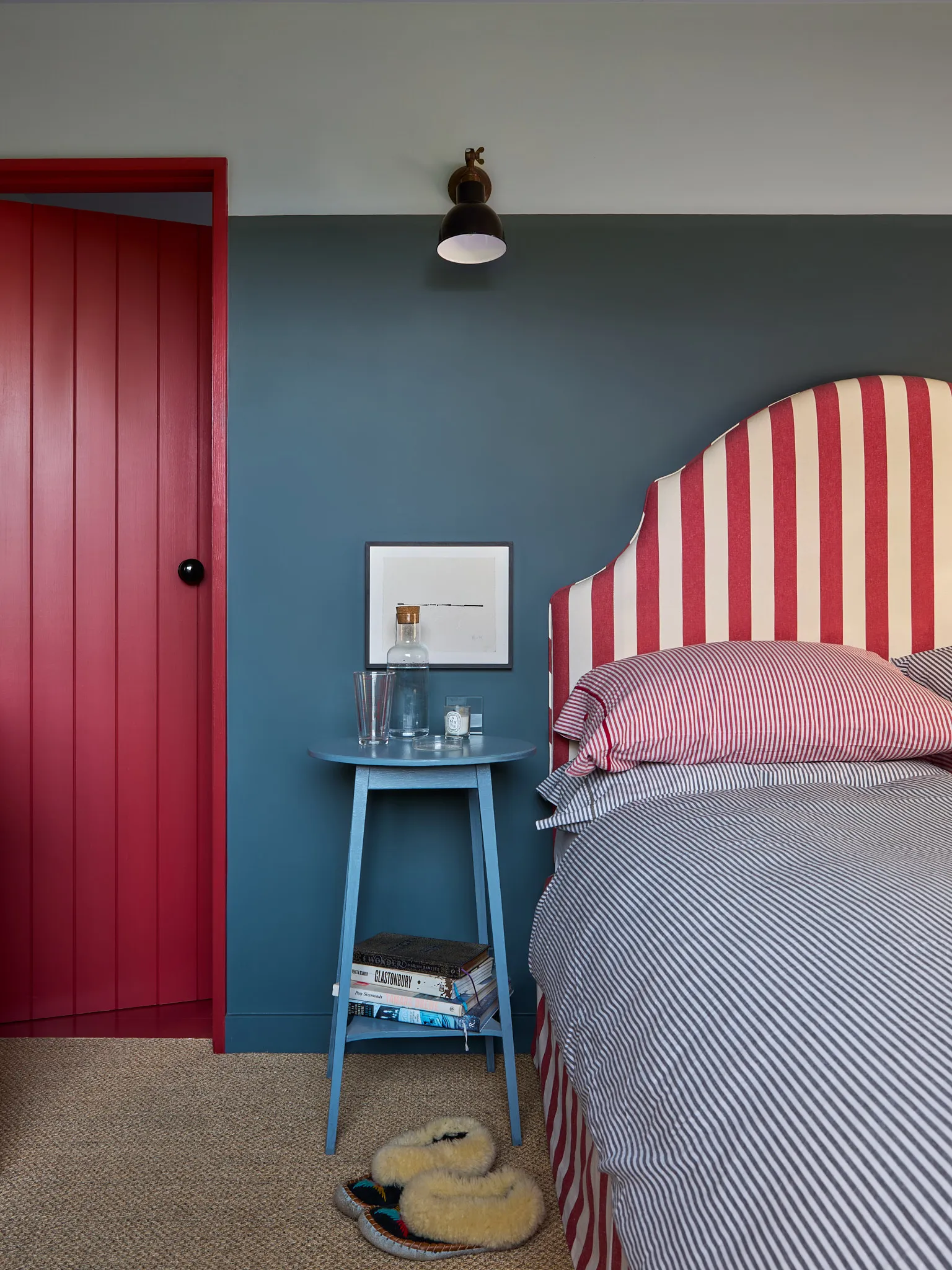
The headboard in this bedroom is upholstered in a striped Ian Mankin fabric by Somerset-based soft furnishing specialists No Naked Windows. A third of the wall is painted Farrow & Ball’s ‘Inchyra Blue’ for a cocooning feel and the upper and the door is coated in Farrow & Ball’s Picture Gallery Red. The bedside table was a flea market buy.
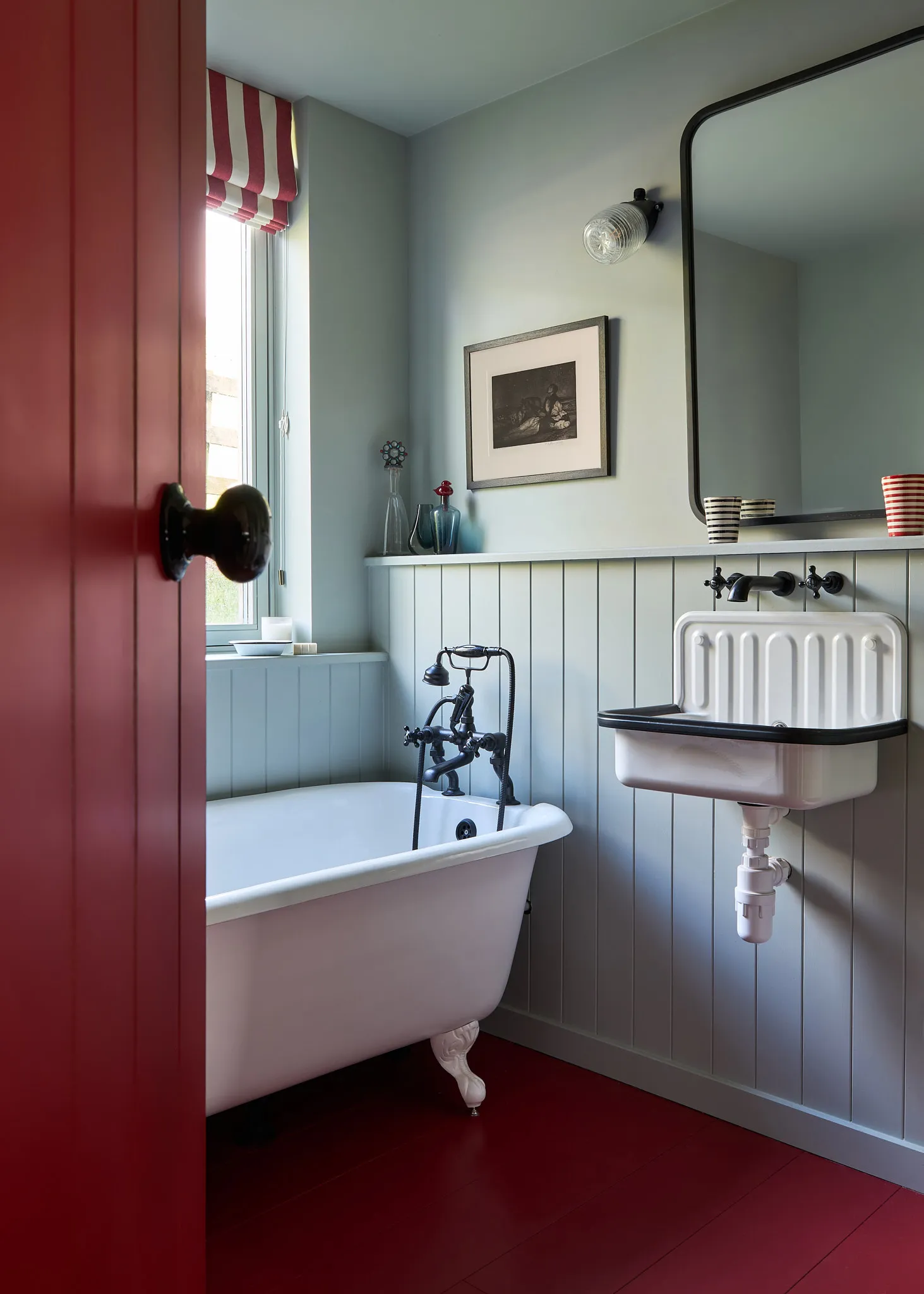
In one of the three bathrooms, the panelling and walls are painted Farrow & Ball’s Light Blue while the door and floor is Farrow & Ball’s Picture Gallery Red. The freestanding bath is from The Cast Iron Bath Company and sits alongside a vintage-style basin from Labour & Wait. The taps are from Dyke & Dean. The striped window blind fabric is from Ian Mankin.



+ There are no comments
Add yours